The 7 Data Visualization Principles Every Designer Needs To Know

Image from pxfuel
Turning data into graphics is a skill. Taking data-heavy content and creating a visual representation that’s almost instantly understandable isn’t as simple as making a chart using different colors. It requires implementing several different principles to create a visual aid that accurately represents the information provided.
Sound complex?
It is if you don’t know what the seven principles of data visualization are.
In this article, we’re going to explain the seven principles and why every designer needs to follow them when converting data into images, charts, graphs, or infographics.
The 7 Must-Know Rules for Data Visualization
1. Decluttering data
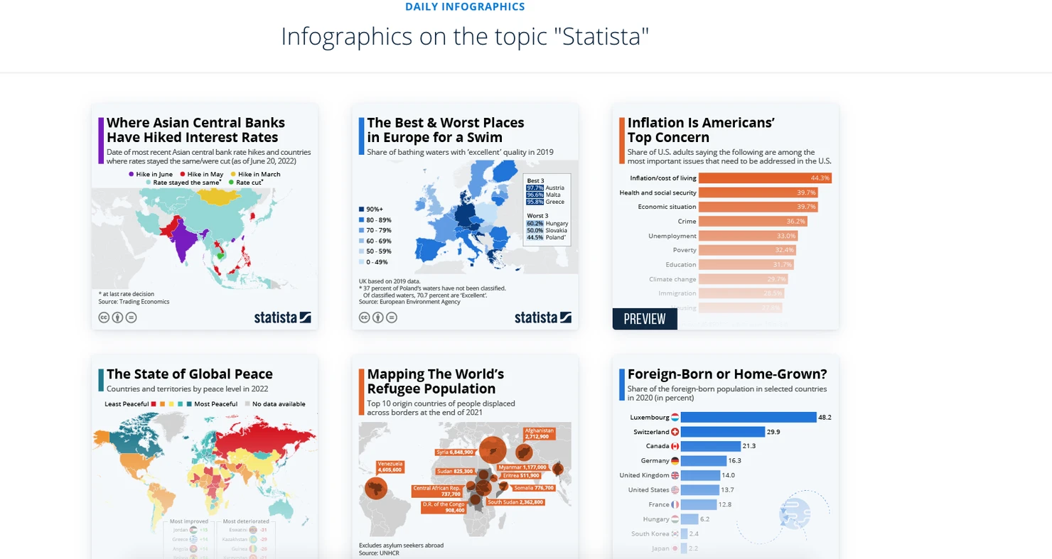
Image from
Simplification and decluttering of data are essential for designers that wish to create engaging yet easy-to-understand data visualizations. You need to break data down into easily digestible, bite-sized chunks to make information easy for your target audiences to understand at a glance.
The simpler you can make your visualizations while still retaining all the most important points, the better the results will be. Statista’s daily infographics do this extremely well, whether using graphs, charts or maps.
2. Creating a balanced design

Image from pxfuel
This step pertains to the composition and presentation of the information within your visualization. Your presentation of data should be balanced—not overwhelming or oversimplified—and appealing to your target audiences.
Many designers use a grid layout to structure their data designs, and others use columns to organize data in the same way that magazines and newspapers do.
3. Focusing on key areas
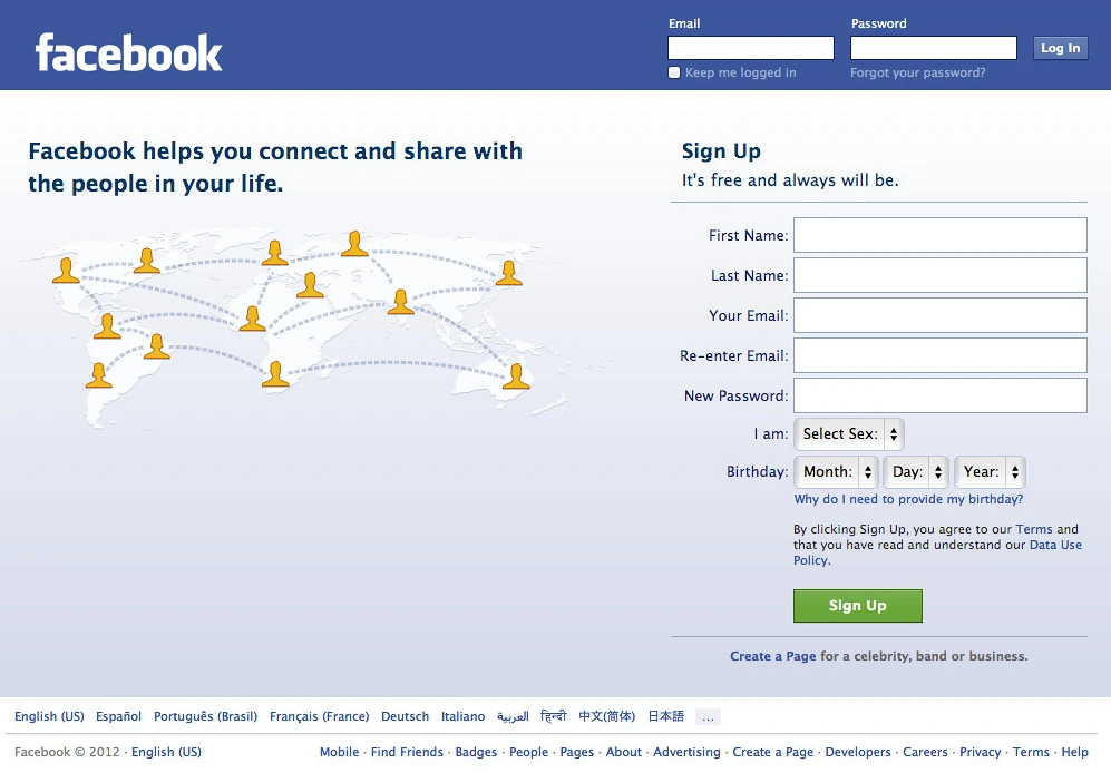
Image from flickr
One of the main points of effective data visualization is that the focus should always be on the most important parts of the data at hand. You can direct this focus by creating a visual hierarchy that draws people’s attention toward certain pieces of information.
There are three popular approaches for achieving this result.
You can use contrasting colors, positioning, and size, to emphasize the most important pieces of data within a visual medium. ‘Eye flow’ is another important consideration. In many cultures, particularly in the West, readers’ eyes move from left to right and up to down across a page—a phenomenon often referred to as the ‘Z path’. Brands like Facebook, Twitter, and Slack successfully use this pattern.
Bear in mind that if you are designing text for readers that read in a different pattern, such as Japanese or Arabic audiences, for instance, you will need to adjust your design strategy accordingly.
4. Incorporating interactivity

Image from weforum
Without interactivity, most data visualizations will fail to capture their readers’ attention for longer than a few minutes. When designing data visualizations, it’s essential to bear in mind that form should always follow function.
Consider movement, balance, simplicity and interactivity in your designs to keep your audiences interested and invested in the core message of your design. If your work is not visually engaging, the intended messages may not reach your audiences. Even if they do, they may not make enough of an impression to encourage readers to remember them in the long term.
The World Economic Forum released a pandemic-related graphic that perfectly showcases how well interactivity works in a design. The data provided was broken down into bite-size chunks and the sizing and format utilized created a feeling of involvement while promoting understanding. They took a complex topic and walked readers through every step.
5. Using patterns and colors

Image from pxfuel 2
Colors and patterns, when used strategically, can help you to direct your audience’s focus and convey concepts more effectively. You can use different colors to create contrast between sets of data, use your strongest and most noticeable colors to highlight the most important pieces of information, and use neutral or faded tones to indicate secondary pieces of data.
While your use of color should ideally correspond to your brand’s color scheme and that of your presentation in general, it’s also encouraged to get creative with your use of hues. Colors are a simple yet powerful way to show an audience exactly what you want them to focus on, and how the focus data should make them feel.
Color psychology is a powerful tool and using colors like red indicates risk or danger, while green is positive and calming. These colors are often used for financial data visualization, as they have clear connotations. You can even use them on an invoice template to highlight a discount and draw attention to a reduced rate.
Additionally, you can use images, shapes, icons and patterns to provide extra context. Using these elements in your designs may be particularly effective if your audience is more creative than logical, as strong supporting visuals can help them to build a clearer picture of your data in their minds. The data itself should, of course, be the primary focus of your designs, but adding unique visual elements can help to add perspective and visual interest to the information you present.
6. Building comparisons

Image from pexels
Comparisons are a crucial part of visualizing data in an engaging way. When you offer your audience a comparison, you allow them to create a clearer picture of the data you are presenting them in their minds, all while enabling them to understand how different pieces of information are connected to one another.
Data comparison charts are a great tool for this, and come in many diverse forms, including pie charts, bar graphs, line graphs, stacked area plots, box-and-whisker plots, and bubble charts. Using charts helps to present information in unexpected and novel ways, which can enhance engagement and keep your audience reading and retaining for longer.
Do some research, find relevant reference images, and choose the most appropriate comparison chart format for each project to ensure that you create data comparisons in a way that is easy to comprehend for your audience.
7. Refining theme and storytelling

Image from pxfuel 3
Data tells a story, and data storytelling informs decision-makers, making it a robust tool in any designer’s kit. Most people will be more likely to engage with your visualization if there is a strong interlinking narrative to support it.
Using data storytelling to present your statistics and information can make it more approachable for your audience while enabling you to communicate your insights in a meaningful and relevant way while strengthening your core messages.
What does the data say about your customers, your brand’s performance, or your opportunities? Storytelling makes your data easier to comprehend for your audience, while simultaneously helping to get them invested in the story you are trying to relay.
The Takeaway
Data visualization is a centuries-old practice that holds particular importance in the age of information. In our digital world, the ability to convey information quickly, accurately, and in an engaging way is more crucial than ever before, particularly if you want to capture the attention of modern internet users, who have an average attention span of around 8.25 seconds.
Making an impactful first impression on your audience is crucial to your success. Use the best practices mentioned above to create immersive and novel data visualizations that your readers will resonate with and learn from.