How to Build a Blog With Great User Experience: Tips and Examples
The goal of your blog is to engage your target audience by encouraging them to read your content. And you can also achieve this if you provide an excellent user experience.
This post discusses how you can better accommodate your readers by tweaking your blog. Doing so enables you to keep them on your blog longer as they read your content in the hopes of turning them into your followers, if not customers.
Let’s begin!
5 Steps to Bring the Best UX to Your Blog
A blog is never just about its content, at least not always. You must ensure that your blog delivers the content in an easy way for your audience. This way, they can read your blog post entirely and perform your desired action if you have a call to action (CTA).
In this case, you must observe the following UX best practices on your blog to make the above a reality.
1. Make the Pages Load Faster
Loading speed is now a Google ranking factor. So if your site loads fast, expect to rank higher for your target keywords.
More importantly, a fast site allows you to deliver your content to visitors instantaneously, thus preventing them from leaving your site and going to your competitors.
To know if your site is fast enough, you must use Google PageSpeed Insights to see your blog’s Core Web Vitals Score.
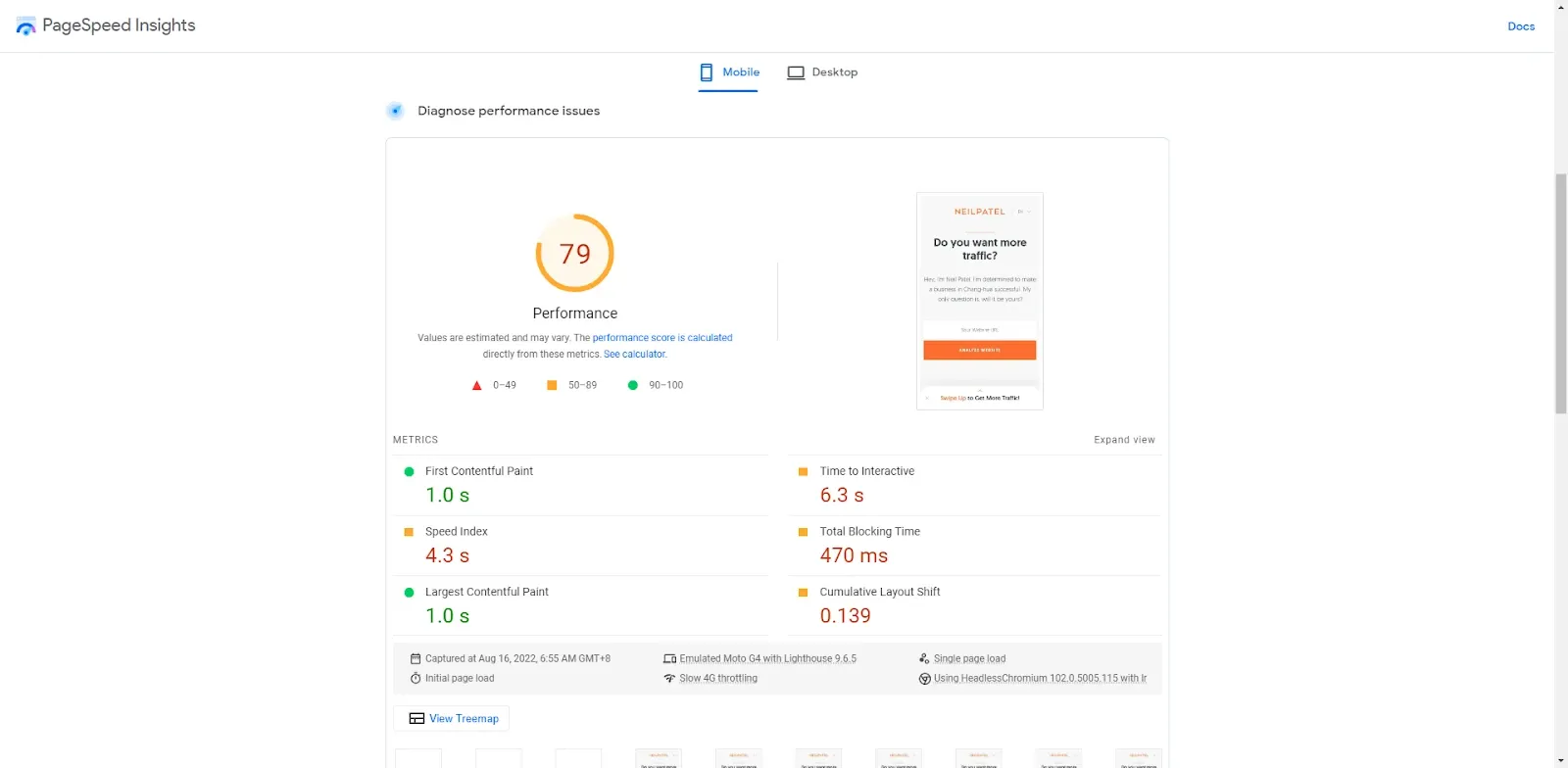
It measures factors regarding loading speed, efficiency, and stability.
If you don’t score that high, you can check the loading speed issues on the page and address them with help from your SEO consultant or web developer.
2. Observe Proper Formatting
How you present your content to readers affects user experience as well.
There are many ways to observe the best formatting practices on your blog, and below are some of the more important ones:
- Write in shorter sentences and paragraphs to improve readability.
- Use the right font and paragraph spacing for your blog’s content width. For maximum readability, you can use a tool like Golden Ratio Typography to know the exact font size, spacing, and content width.
- Insert visual content like images and videos to break up the monotony of text in your blog. Get images from free stock photo sites or premium sites like Depositphotos if you want to feature more unique photos.
- Make your introductions short and sweet. Three paragraphs explaining the post and why they should read it should be more than enough.
- Use bucket brigades to sustain readers' interests as they plow through your content.
3. Consider Removing Sidebar
Blog sidebars are a way for bloggers to showcase links and offers to their audience.
The beauty of sidebars is that they appear beside the content when viewed on desktops. As a result, this area is prime real estate for bloggers to push their products and services to visitors, resulting in higher conversions and revenue.
However, sidebars appear at the bottom when the page is viewed on mobile devices. Unlike before, users must scroll down the page to see the bloggers’ offers and links.
Since they no longer appear on top of the page, mobile conversions of sidebar links are much lower.
This is important since more people are using mobile devices to view websites nowadays.
At the same time, Google prioritizes mobile-first indexing, in which the search engine will rank the page's mobile version.
These changes may have put the value of sidebars down by the wayside.
However, this doesn’t mean that you should remove sidebars from your layout. They may still play a role in your blog’s user experience, especially if you have more desktop users than mobile.
Nonetheless, removing it must be considered at the very least. You should either include the links and offers within the content body to get more people to see them or remove them entirely.
Either way, you must decide which path will make for a much better user experience.
4. Reduce Options
People visited your site to read your content about the topic they searched for online.
They’re not interested in the offers on your pop-ups or ad banners.
At the same time, you can’t load up your pages with multiple calls to action that have nothing to do with your content’s topic.
All these things disrupt the user experience and prevent people from reading your post, which is what they came to your blog for in the first place.
Limiting these elements from appearing on your blog posts, if not removing them entirely, makes your content the star.
This brings us to the next and last point:
5. Write About What Users Want to Read
It’s not enough to write great content. As mentioned, it needs to deliver the information that your audience is looking for.
For example, if your readers are looking for tips on designing an About Us page, they want to know the different ways to make their site’s about us page better, full stop.
They don’t want to know the history of About Us and why this page is important on your site.
By directly addressing your audience's pain points, you personalize the content to their needs, leading to them reading your post from top to bottom.
To do this, you need to determine the topic’s user intent.
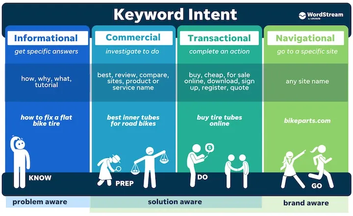
Image from WordStream
The example above (designing an About Us page) has an informational user intent, i.e., readers want to know more about the topic and how to put the tips into practice.
Other topics will have commercial intent, in which people need your content to make purchasing decisions. Examples of these topics include product reviews, comparisons, and roundup posts.
Once you have figured out the intent, you can create content that fulfills what your audience wants to read from it.
Top 8 UX Design Blog to Inspire You
If you’re looking for more ideas on how to provide your blog visitors with a great UX or for websites that specialize in user experience as a topic, below are must-visit blog resources and inspirations in alphabetical order:
1. Ahrefs
When it comes to SEO tools, Ahrefs immediately spring to mind. It boasts one of the best and largest databases for content and backlinks, making research and analysis easier if you want to rank your website at the top of search results.
The tool’s excellence trickles down to other business facets, including its blog.
Aside from the quality of information, all its posts have custom-featured images that capture its brand. The content presentation is also top-notch, with a clean interface and fast-loading elements.
But perhaps the best thing about Ahrefs’ blog is how it incorporates the tool seamlessly in all the topics its posts cover.
By featuring screenshots showcasing its product features across all relevant posts, Ahrefs creates a user experience unique to its brand.
This allows people to come back for more blog content that features other use cases for the tool, which could ultimately convince them to subscribe to the product!
Website: https://ahrefs.com/blog/
2. Awwwards
Unlike all of the blogs in this list, Awwwards is not a user experience blog by standards. Instead, it features blogs with the most innovative designs and layouts across various industries.
You can browse the site according to categories for inspiration.
To help you find the best designs regardless of category, check its Winners and Nominees tabs to see the latest blogs that made its list. In addition, you can filter the results into technologies and colors to help narrow down the results and find blogs that capture what you have in mind.
There's also an option to submit your site if you want to showcase your blog design to the world.
Website: https://www.awwwards.com/blog/
3. CareerFoundry
CareerFoundry is a website for people who want to turn their passion for web design and development into fruitful careers. It offers premium courses spanning from basic UX principles to advanced front-end development.
But if you simply want to educate yourself with their free resources, you can start with their blog. Its posts written by professional developers and industry experts provide the basic foundation of the best UX and UI practices you must observe in your profession.
As a site owner or blogger, expect to pick up a thing or two on how you apply its teachings on your layout and design to improve retention and conversion rates.
Website: https://careerfoundry.com/en/blog/
4. CXL
Formerly known as Conversion XL, CXL specializes in conversion-focused topics ranging from user experience and persuasive design to CRO and testing.
The site is valuable for people looking to jumpstart their digital marketing careers. It contains training materials offering mini-degrees and marketing courses guaranteed to enhance your knowledge of the practices above. CXL also boasts a helpful and vibrant community of marketers of all levels looking to learn from you or teach what they've learned through the years.
Its blog section practices what it preaches: a clean and straightforward layout containing no CTA. This put the content at the forefront of the experience, which includes tons of value about the covered topics.
Website: https://cxl.com/
5. Smashing Magazine
Smashing Magazine is one of the longest-running UX blogs online.
With more than 3,400 articles in over a decade, the site has documented the UI trends and best web design and development practices. Everything you can find about both topics published throughout the past ten years, you'll most likely find it here.
The site also features books for sale, online workshops, and conferences you can attend so you can learn more about UX and UI outside of the site. But if you wish to stick with the website, its membership options allow you to jumpstart your professional UX/UI career.
Website: https://www.smashingmagazine.com/
6. Unbounce
It shouldn’t be a surprise that Unbounce, a landing page software, boasts a blog with some of the best UX. After all, its goal is to mobilize visitors towards the pager’s call to action, thus increasing conversions.
Unbounce has a straightforward, no-frills approach to blogging, with proper spacing and excellent use of white space.
Each blog post has a unique and prominent CTA that readers can’t miss, depending on its topic. Having this call to action at the end leads readers to perform the blog’s desired action.
Similar to Ahrefs, Unbounce uses the platform’s feature to help elaborate the points it's trying to make with its blog posts. Showcasing the product this way shows the tool’s power as intended.
And to help readers take Unbounce for a spin, there are two CTAs at the bottom of the page just above the footer that points to the product demo and pricing page. Both help readers decide whether to take Unbounce for a spin.
Website: https://unbounce.com/
7. UX Collective
UX Collective is a Medium-based blog from users of the platform. What makes this different from the blogs featured in this list is you can publish your story and reach out to its audience of 300,000 designers all over the world.
Besides that, the blog is a great source of information for UX and product design from Medium writers with tons of experience in this field. Check out the blog's Editor's pick section to get straight to the best articles UX Collective has to offer.
If you enjoy the blog's published pieces, you can subscribe to its newsletter and receive the latest posts straight to your inbox.
Website: https://uxdesign.cc/
8. UX Matters
UX Matters is another blog covering the user experience spectrum from design to A/B testing.
It has some of the most technical articles in the UX space, as the blog's Top Articles section lists 25 of the best pieces the blog has had since 2007. There's also a Columns section featuring case studies and unique insights from the brightest minds in the UX industry.
Website: https://www.uxmatters.com/
Conclusion
Crafting a great user experience for your blog visitors is a process. It takes a combination of great content and a bit of technical knowledge to tweak your blog to achieve greater engagement and conversion rates.
Hopefully, the tips above should give you a head start on getting there.

