The Top 20 Effective Tips on Creating Engaging Infographics
You may have seen blogs or social media posts with eye-catching infographics. So, you have decided to create an infographic too. But during designing, you’ve realized that it doesn’t look as professional and eye-catching as the ones you have seen on the internet. So, if this sounds like you, we have got you covered.
From the definition of infographics to their role in keeping the viewers engaged, we will cover everything here. But most importantly, we will discuss the top 20 effective tips on creating engaging infographics here. So, without wasting any time, let’s begin this discussion.
What Is Infographic?
The term ‘infographic’ refers to conveying information in visual forms, such as charts, diagrams, or graphs.
Infographics provide an effective way to educate or inform an audience. They make complex ideas easier to understand and digest. So, infographics are a preferred way of consuming information.
The Role of Infographics in Viewer’s Engagement:
Humans transmit 90% of the information to their brains through visuals. Plus, they are more likely to read something that contains color images. So, no wonder why people prefer consuming information through infographics than through an article with only text.
In fact, studies show that users only read one-fourth of the words on a web page. So, if you want to decrease the bounce rate of your website or blog, you must incorporate infographics in your posts.
Top 20 Effective Tips on Creating Engaging Infographics:
1. Understand your audience:
Before discussing how to make a good infographic, it is essential to understand your audience. Doing this will provide insights, like thorough knowledge and unmet needs of your industry’s audience.
Thus, if you answer those unmet needs through your infographics, you have already achieved the first goal of engaging your audience.
2. Create infographics according to your content:
The next tip is one of the most critical tips in this guide, as it focuses on creating relevant infographics.
Infographics aim to make the information easier to understand for their viewers. But how can infographics help viewers if their content is irrelevant to the topic? Therefore, to fulfill the purpose of including infographics, it is essential to keep them relevant to your topic.

Image from venngage.com
3. Analyze the convertible elements in your information:
The purpose of infographics is to make a topic easier to understand for viewers without reading it like a novel. So, your first job is to identify the elements in your information that are convertible to visuals. Statistics can be a prime example of such elements because you can easily describe them through graphs.
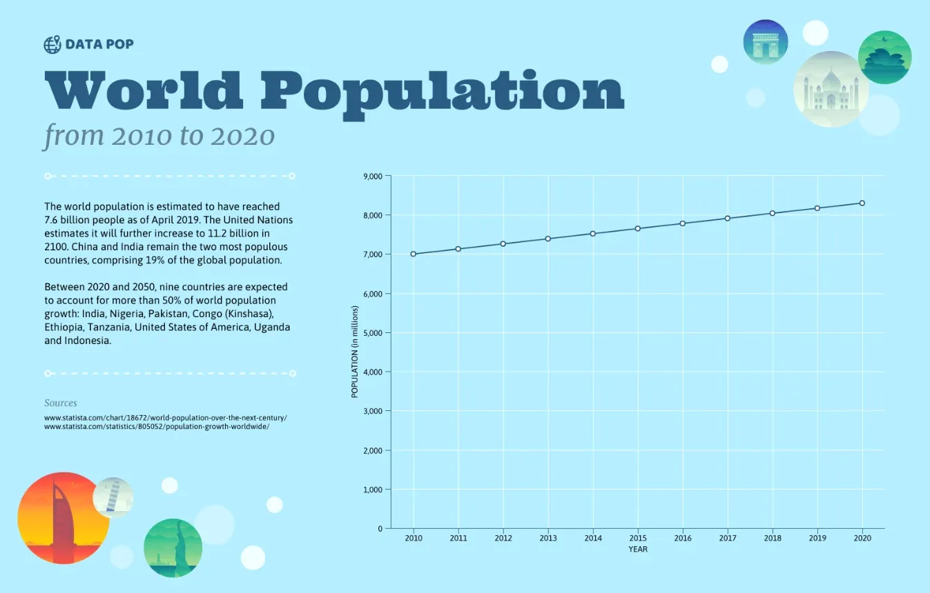
Image from venngage.com
Similarly, if you are working on something related to the workplace, you can include a cartoon working on a desk in your infographics.
4. Include the necessary information:
Once you have found the convertible elements, your next task is to remove unnecessary information.
As mentioned earlier, the text in infographics should not be like a novel. So, your infographics should only contain the information that directly conveys your key message to the viewers.
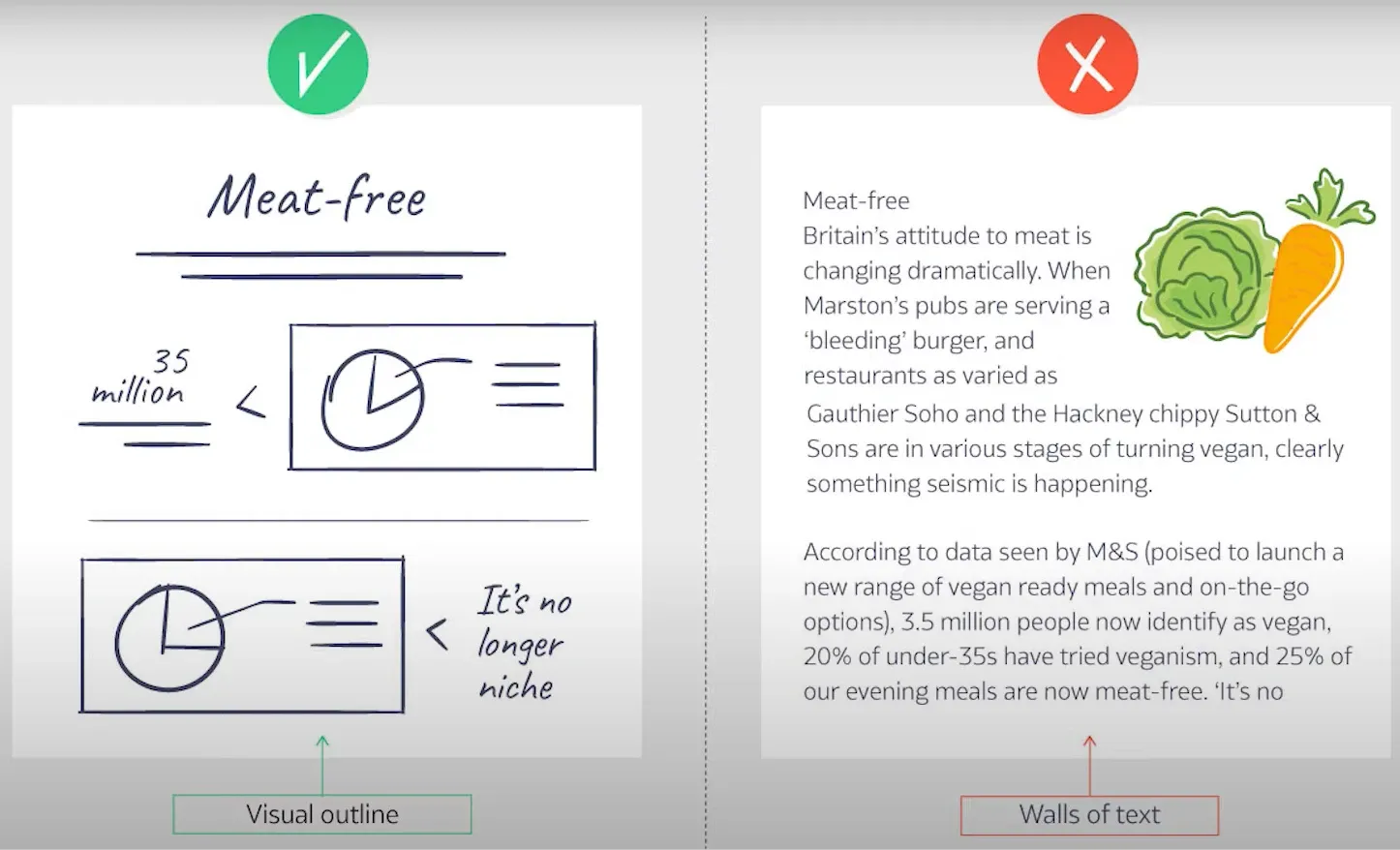
Image from Visme
5. Outline your ideas:
Once you have finalized the information you want to include and identified the convertible elements, the next task is to create an outline of your ideas. Doing this will help you visualize your final product.
6. Follow a consistent typography styling approach:
One of the easiest ways to outclass your competitors through infographics is to use unique and bold typography styles. However, use the following typography rules for your infographics.
- Avoid using more than 2-3 font families in your infographics.
- If you want to add variation in the typography of your infographics, change the styling of current font families.
- The coloring scheme of your typography should balance out with icons and other elements.
- If you want a different color scheme, your color choice should not exceed 2-3 coloring schemes. Anything more than three will be a deal-breaker for the ‘engaging’ aspect of your infographics.
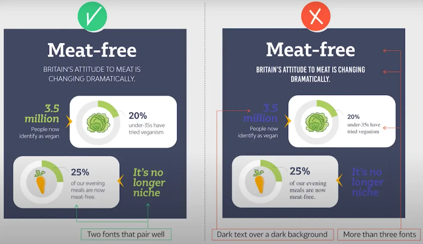
Image from Visme
7. Prevent your infographics from a sloppy look:
The next tip is essential because it helps in preventing your infographics from a cluttered look.
This tip describes the importance of keeping even margins around the edges of infographics. So, while designing infographics, you should leave even space from the top, bottom, left and right sides. This way, you will have a higher chance of maintaining the viewers.
Thus, if you implement this tip correctly, you will more likely be able to keep the viewers engaged with your content. In fact, Aric Wiliiam, a writer and graphics designer at an essay writing service, has used this tip to increase user engagement in his content.
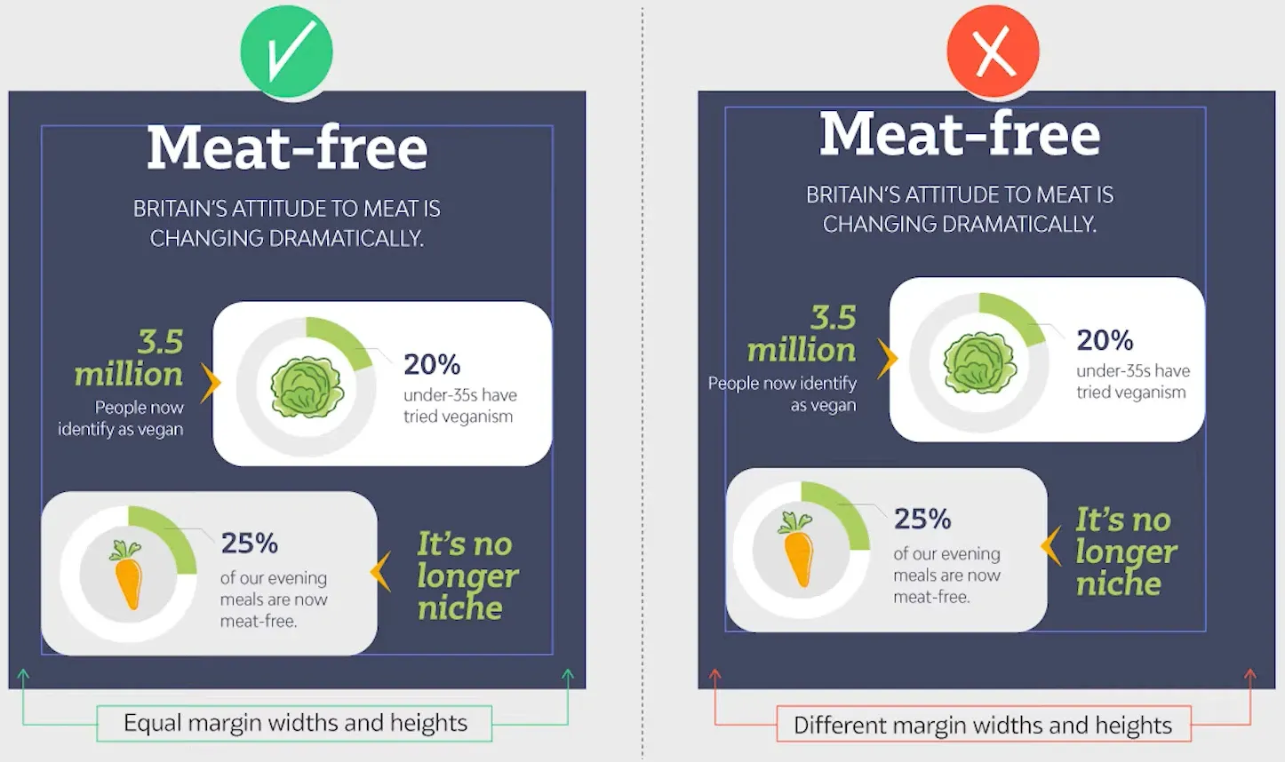
Image from Visme
8. Avoid clogged gutters while designing infographics:
Like the margins, avoiding clogged gutter within the design of infographics is also essential. So, while creating and placing elements within the structure of the infographic, you should leave reasonable space between them. This way, the information in infographics will be more understandable to viewers.
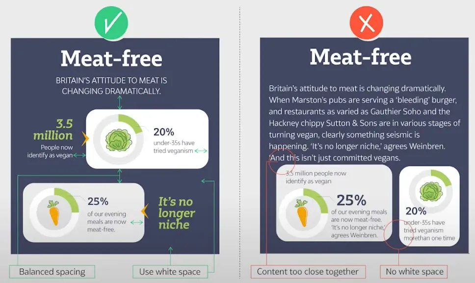
Image from Visme
9. Understand the psychology of colors:
While choosing a coloring scheme for your infographics, you can either go with your brand’s theme color or pick a matching color with your brand. But if you have decided to break the norm and stray away from the brand’s theme or matching color, you should always use attractive colors.
The bright colors indicate happiness, whereas the dark colors are gloomy. So, before choosing the coloring scheme, you must understand the psychology of colors.
But if you choose the wrong coloring scheme, your message won’t be clear to viewers. So, using an incorrect coloring scheme will ruin the entire purpose of incorporating infographics.
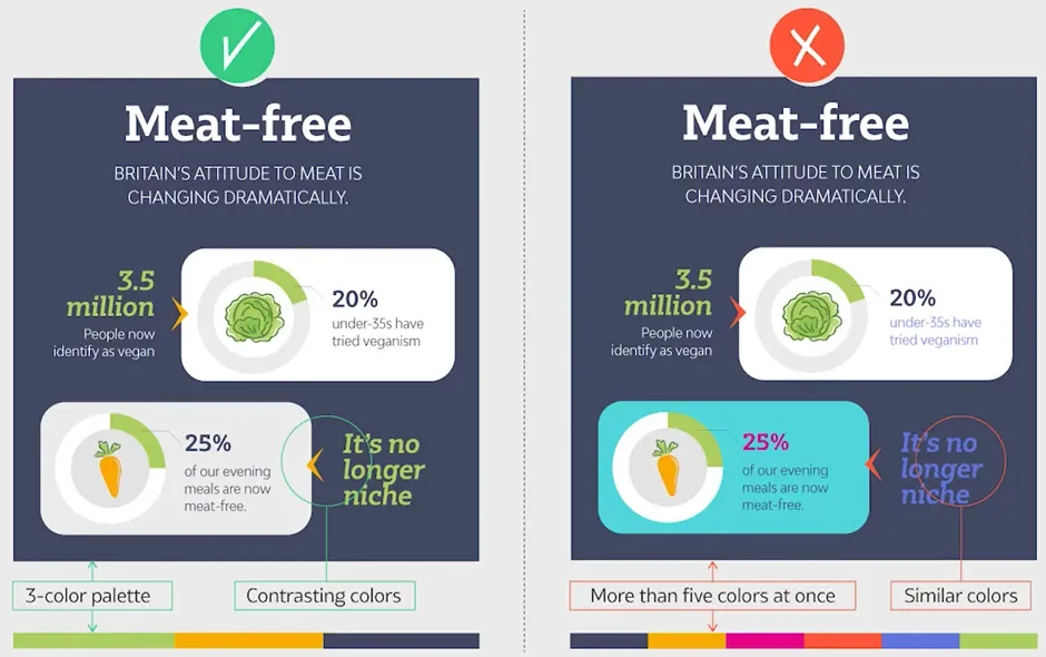
Image from Visme
10. Maintain visual hierarchy in infographics:
Like the content of a website or a blog post, infographics also have a visual hierarchy. So, in infographics terminologies, the term ‘visual hierarchy’ refers to placing elements of a design according to the order of their importance. But this doesn’t mean that every element of visual hierarchy should have a different size.
Visual hierarchy elements in infographics:
Generally, there are three elements in the visual hierarchy of infographics:
-
Title:
The title will be at the top and you should represent it with the largest font size.
-
Sub-headers:
The font size of sub-headers will be slightly smaller than the title. However, it should be bigger than the rest of the text to be easily recognizable as a sub-header.
-
Text:
The font size of the rest of the text should be large enough to easily readable from a greater distance. Generally, designers recommend using the text size of at least 14 pt. for the content of infographics. However, using a text size greater than 14 pt. will be ideal.
Thus, while designing infographics, some details are more important, whereas others are not unnecessary but have less importance. That is why preferring the most critical information while creating infographics should be your priority.
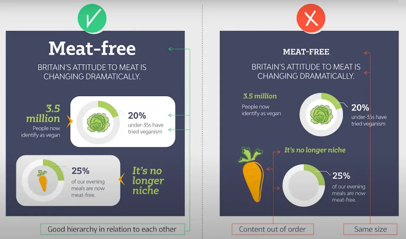
Image from Visme
11. Use substantial-sized elements:
The infographics elements, like icons and sub-headers, should have substantial sizes. A general rule of thumb is to keep the size of infographics elements according to their importance. So, you should follow a consistent size for elements throughout the infographics.
As far as the repeating elements are concerned, you can use the same size for them. But the elements of infographics should not be large enough to the point where they compete for attention.
Image from Visme
12. Size of infographics:
Infographics are not limited to blogs and websites because people also use them on social platforms. However, there is no such thing as a universal infographics size because different platforms have different requirements.
Generally, infographics are of square and vertical shapes. So, content creators use the following infographic sizing guidelines:
- Square or Landscape: You can use the square or landscape infographics shape if you create content on Instagram.
- Vertical: The vertical form of infographics is ideal for Pinterest. However, you can crop a square from vertical infographics and use it on Instagram.
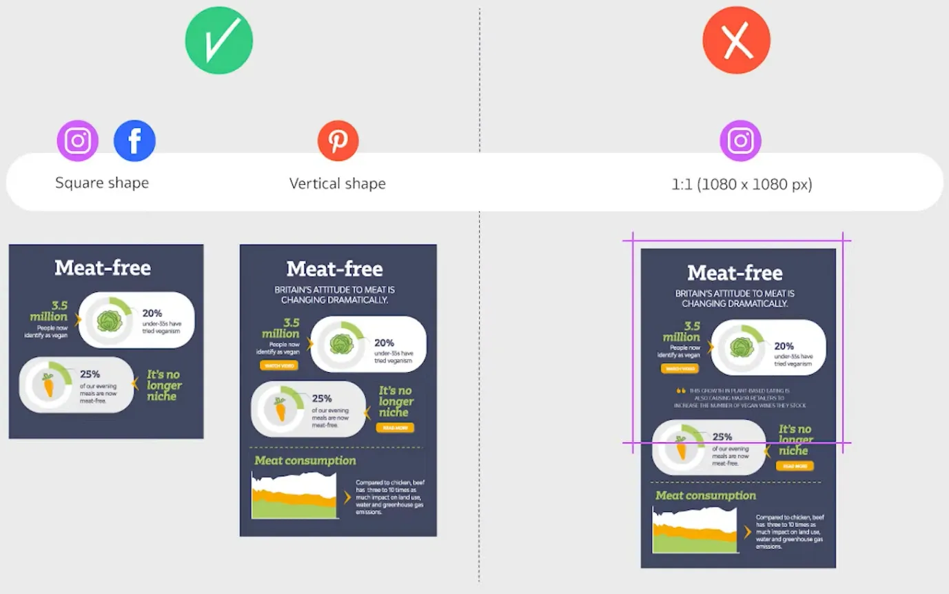
Image from Visme
Thus, when it comes to the size of infographics, always plan ahead and optimize your infographics for the right platform. But if you have trouble understanding the size of infographics according to different platforms, you can use social media infographic templates.
13. Use images and be a trend breaker:
Generally, infographics contain illustrations. But you can outclass your competitors by being a norm breaker and using images.
Thus, if you want to use images in infographics, you should keep the following points in mind.
- You should always prefer high-resolution images.
- You can’t use any image from the internet, as some pictures require you to purchase the rights. So, an excellent way to avoid this is by using royalty-free images. For more details, see the third last tip of this top 20 effective tips on creating an engaging infographics guide.

Image from Pixabay (Left/Right)
14. Follow a consistent icons style:
Icons for infographics come in several styles. But the following are the most common ones:
- Line icons.
- Flat or solid icons.
- Isometric icons (like 3D).
So, whichever icon style you choose, you should follow the same icon style throughout the infographics. Plus, the color of your icon should match your text. Otherwise, your infographics will look sloppy.
However, like images, you can’t use any icon from the internet. So, your preference should be to use free icons. But if you want to use a licensed icon, you should purchase its license before using it in your infographics.
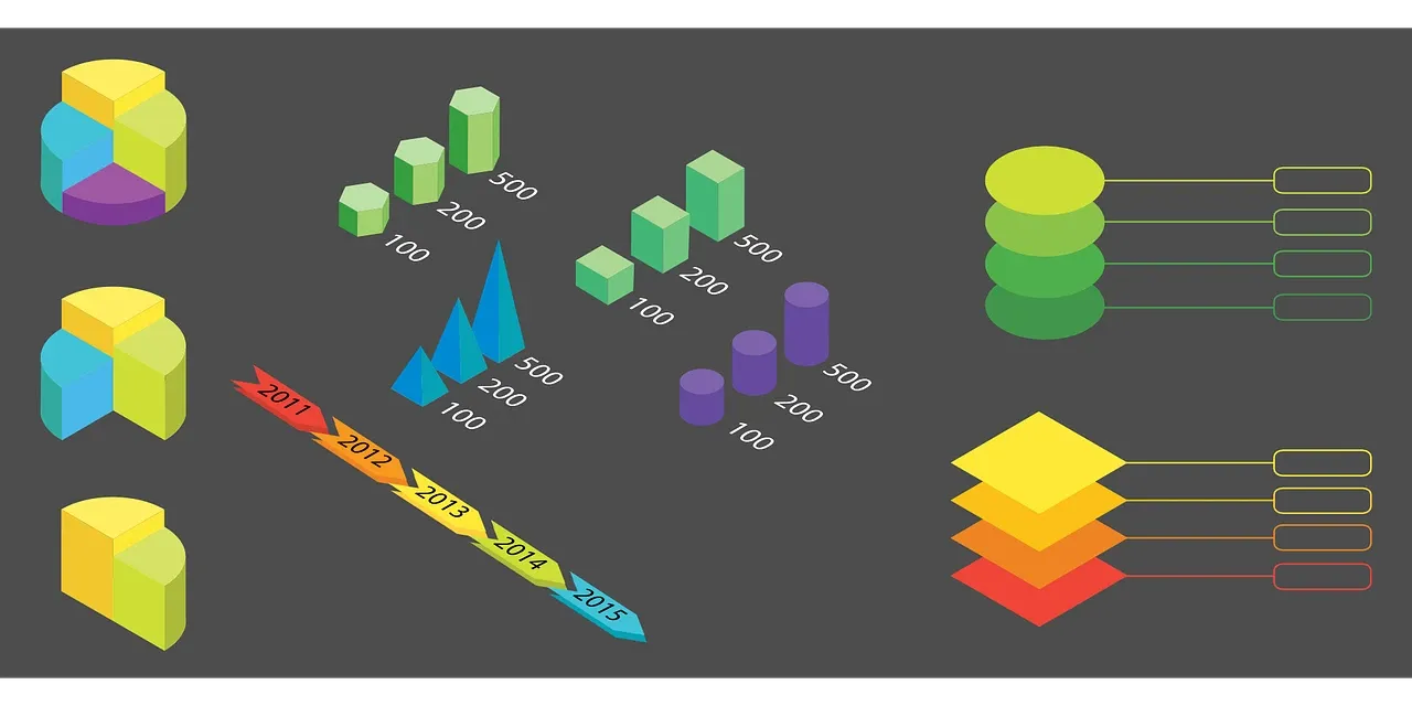
Image from Pixabay shows the consistent use of 3D icons
15. Understand the importance of interactive elements:
Including interactive elements in infographics is the best way to keep a user engaged with your content. However, including interactive elements is only easier for tech geeks because it requires tweaking a few things in the website’s HTML editor. An easy solution to this problem is using infographics templates with built-in interactive elements.
Thus, by adding interactivity to infographics, you can increase viewer engagement and keep them focused on your brand.
16. Don’t forget to include animations:
Like adding interactive elements, adding animations to infographics is another ideal way to increase engagement. It may seem a scary task. But you should know that the benefit of standing out and catching attention right away is always worth a little extra work. So, give preference to animations in infographics.
But before you dive into adding animations, you should learn some dos and don’ts of including animations in infographics.
- Always keep the animations balanced. But don’t have them all move out at the same time.
- Use the same delay time for each animation (one after the other).
- Don’t get carried away while using animations in infographics.
17. Never ignore the data widgets:
Infographics without information are useless. Therefore, including research-based data in infographics is essential.
Like elementary school, you can take assistance from charts, flowcharts, graphs and maps to add research-based data in infographics. Doing this will create a perfect data widget for your infographics. But again, do not go overboard while including and creating data widgets.
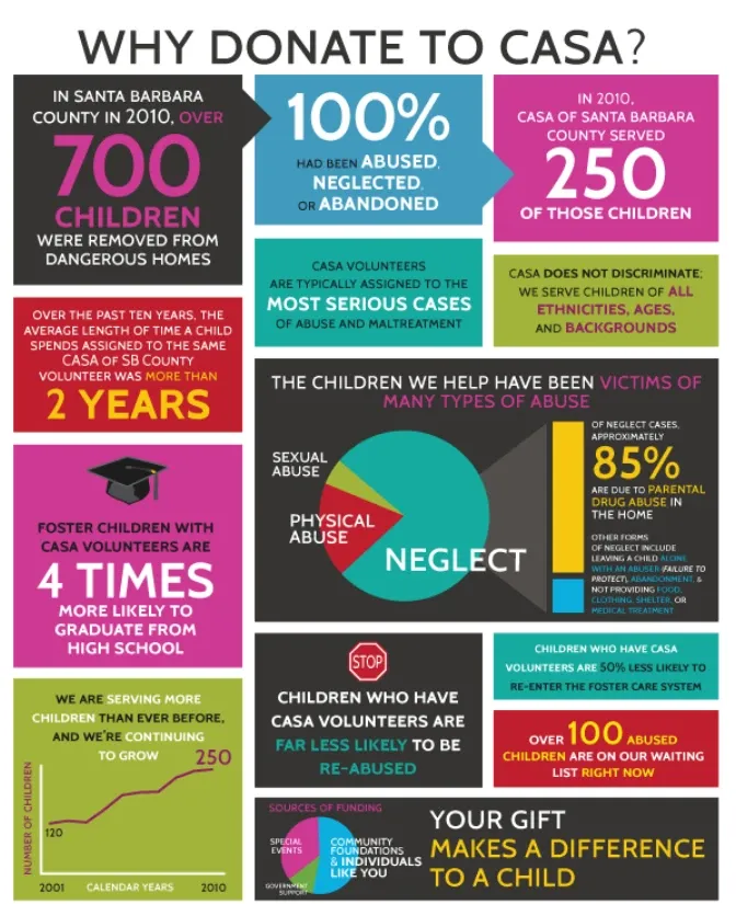
Image from Behance
18. Don’t overlook legal issues:
The last thing you want is to find a notice in your mailbox requiring legal action for the elements you have used in infographics. Therefore, you should always use royalty-free elements, as they don’t need licenses. But if you can’t find a suitable component from the royalty-free category, you can use the licensed materials after purchasing their license.
It is better to be safe than sorry. So, the best practice is to include links to sources from where you have used materials or information in infographics. But your links should not be long, which brings us to the second last point.
19. Avoid adding long links:
You may have seen infographics that contain lengthy links. But that’s not a good practice, as there’s a difference between linking to the source and ridiculously adding long links.
The truth is, no one will remember the lengthy URLs. So, a good practice is to use third-party tools to add short and clickable links to your infographics. Similarly, you can also choose to add a QR Code to infographics.
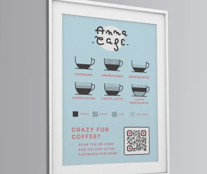
Image from QR Codes Generator
20. Ruthlessly edit your infographics:
The last tip is to edit your infographics. However, many people ignore this tip.
The point is, first drafts will never be perfect and each word in infographics has a specific purpose. So, you should ruthlessly review your infographics and exclude any word that falls under the fluff content criterion.
In a Nutshell – the Conclusion:
On average, a human brain processes more than 100,000 words daily, excluding the time spent at work. And because humans receive five times as much information as they did in 1986, sometimes, it’s hard to consume information in text format. That’s where infographics come into the picture.
Infographics make it easier for viewers to understand and digest complex information. That’s why infographics usage has increased by four times since 1990. But infographics are only effective if they contain concise and to-the-point information. So, read the above guide to understand some dos and don’ts of creating engaging infographics.
Related Posts